Chapter 15 of 34
Header models: multi-row and grouped
Group columns under a common header – and let users collapse the groups.
After this chapter you can
- describe header groups with CellGroupIf
- make groups collapsible
- build a multi-row header from data
Describe the groups
The header is an area model like the body (chapter 11 (TableModel & areas)). AreaModelCellGroups
builds a multi-row header from a tree of CellGroupIf: a group has a label (data) and
children; a leaf has a property and becomes a column.
import {  AreaModelCellGroups, AreaModelObjectArrayWithColumndefs, type CellGroupIf, CellgroupFactory,  EventAdapter, SimpleDomService, TableFactory, TableOptions, TableScope, px80, px110, px120, px160} from "@guiexpert/table";import { createOrders, type Order } from "./data/orders";
const groups: CellGroupIf[] = [  { data: "Order", children: [{ data: "ID", property: "id" }, { data: "Date", property: "date" }] },  { data: "Customer", toggle: true, children: [                        // toggle → collapsible (❯)    { data: "Customer", property: "customer", visibility: "always" },  // stays when collapsed    { data: "Country", property: "country" },    { data: "City", property: "city" }] },  { data: "Product", toggle: true, children: [    { data: "Product", property: "product", visibility: "always" },    { data: "Category", property: "category" }] },  { data: "Amount", children: [    { data: "Qty", property: "quantity" }, { data: "Price", property: "price" }, { data: "Total", property: "total" }] }];
toggle: true– the group gets a ❯ button and can be collapsed.visibility: "always"– this column stays visible when the group is collapsed; the others disappear.
Build columns, header and body
CellgroupFactory.buildGroupExts() and CellgroupFactory.buildColumnDefs() derive the
column definitions from the groups. Header and body share them, so the body model must know them too –
AreaModelObjectArrayWithColumndefs maps a column index to the property:
const columnDefs = CellgroupFactory.buildColumnDefs(CellgroupFactory.buildGroupExts(groups));for (const def of columnDefs) {                      // the default width is 100 px  def.width = ["customer", "product"].includes(def.property) ? px160 : def.property === "id" ? px80 : def.property === "date" ? px120 : px110;}const header = new AreaModelCellGroups("header", groups, columnDefs, 34);const body = new AreaModelObjectArrayWithColumndefs<Order>("body", createOrders(10_000), columnDefs, 34);const tableModel = TableFactory.createTableModel({ headerAreaModel: header, bodyAreaModel: body, columnDefs });
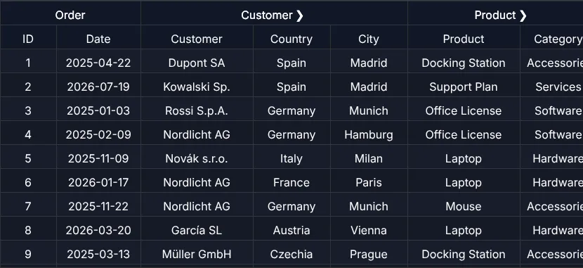
const host = document.querySelector<HTMLDivElement>(".table-div")!;new TableScope(host, tableModel, new SimpleDomService(), { ...new TableOptions() }, new EventAdapter())  .firstInit();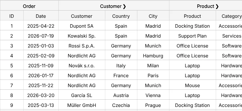
Without groups: several header rows
If you only need two header rows without collapsing, headerData with two rows is enough
(chapter 14 (Array of arrays)). Spanning header cells come from AreaModelIf.getColspanAt() –
exactly like in the body (chapter 29 (Rowspan & colspan)).
Next
The other end of the table: a footer with totals that follow the filter – chapter 16 (Footer totals).