Chapter 28 of 34
Theming and dark mode with CSS variables
Everything is a CSS variable – light and dark are built in, your brand is a few lines away.
After this chapter you can
- override --ge-table-* variables
- switch light and dark
- scope a theme to one table
Everything is a CSS variable
main.css (chapter 4 (Installation)) defines more than 100 variables with the prefix
--ge-table-: backgrounds and text per area and side (chapter 11 (TableModel & areas)), borders, zebra
rows, hover, focus, selection, progress bars, tree arrows. A light and a dark set are built in.
html, html[data-theme="light"] { --ge-table-bg: #fff; --ge-table-header-center-bg: rgba(233, 233, 233, 0.5); --ge-table-header-center-text: #000; --ge-table-body-center-text: var(--ge-table-header-center-text); …}html[data-theme="dark"] { …}Your own look
Override the variables in a stylesheet that is loaded after main.css:
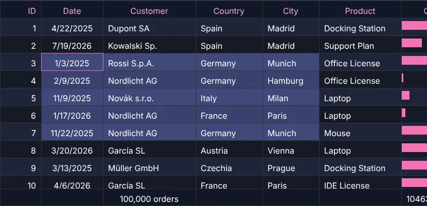
html[data-theme="light"] .brand-table { --ge-table-header-center-bg: #eef2ff; /* indigo-50 */ --ge-table-header-center-text: #3730a3; /* indigo-800 */ --ge-table-body-center-text: #111827; /* the body text follows the header colour by default */ --ge-table-body-west-text: #111827; --ge-table-body-east-text: #111827; --ge-table-row-even-bg: #fdf2f8; /* zebra: pink-50 */ --ge-table-hover-row-bg: rgba(244, 114, 182, 0.18); --ge-table-focus-border: #db2777; --ge-table-body-center-selected-range-bg: rgba(79, 70, 229, 0.22); --ge-table-color-progress-bar: #f472b6; --ge-table-footer-center-bg: #e0e7ff;}html[data-theme="dark"] .brand-table { --ge-table-header-center-text: #f9a8d4; /* pink-300 */ --ge-table-row-even-bg: rgba(129, 140, 248, 0.08); --ge-table-hover-row-bg: rgba(244, 114, 182, 0.2); --ge-table-focus-border: #f472b6; --ge-table-body-center-selected-range-bg: rgba(129, 140, 248, 0.35); --ge-table-body-center-selected-range-text: #ffffff; --ge-table-color-progress-bar: #f472b6;}
Here the selectors end with .brand-table, so only this one table is themed – CSS variables are inherited, a class on
any parent is enough. Drop the class to theme every table of the app.
Light and dark
The table follows the attribute data-theme on <html>:
// light / dark: one attribute on <html> – the built-in variables of both themes are already thereconst setTheme = (theme: "light" | "dark") => { document.documentElement.dataset.theme = theme; try { localStorage.setItem("theme", theme); } catch { /* private mode */ }};themeButton.addEventListener("click", () => setTheme(document.documentElement.dataset.theme === "dark" ? "light" : "dark"));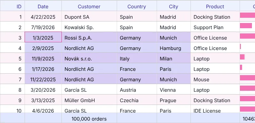
More
The showcase Look and feel switches between several complete themes. The Doc page lists the CSS classes.
Next
Merged cells: chapter 29 (Rowspan & colspan).