Chapter 26 of 34
Framework components as cells
A real React or Angular component per cell – created only for visible cells.
After this chapter you can
- wrap a React component as renderer
- implement ComponentRendererIf in Angular
- know the lifecycle
Why components?
A cell renderer builds DOM by hand. If your design system already has a
<StatusChip>, a tooltip or a menu button as a component, you can put the component itself into the cell.
Each wrapper package has an adapter that turns a component into a CellRendererIf.
The shared model of the framework demos accepts optional body renderers per property:
import { CellRendererIf, ColumnDef, TableFactory, TableModelIf } from "@guiexpert/table";import { createOrders, Order } from "../data/orders";
/** * The orders table used by the framework demos (episodes 006–010) – one model for every framework. * Episode 026: optional body renderers per property, e.g. a framework component for "status". */export function createOrderTableModel(  rowCount = 100_000,  bodyRenderers: Partial<Record<keyof Order, CellRendererIf>> = {}): TableModelIf {
  const rows = createOrders(rowCount);  if (!Object.keys(bodyRenderers).length) return TableFactory.createTableModel({ rows });
  const properties = Object.keys(rows[0] ?? {}) as (keyof Order)[];  const columnDefs = properties.map(property => ColumnDef.create({    property, headerLabel: property.toUpperCase(), bodyRenderer: bodyRenderers[property]  }));  return TableFactory.createTableModel({ rows, columnDefs });}
React
// Episode 026 – a React component as cell renderer. Hooks work: it is rendered as a real element.import { useState } from "react";
interface CellProps { cellValue: string; rowIndex: number }
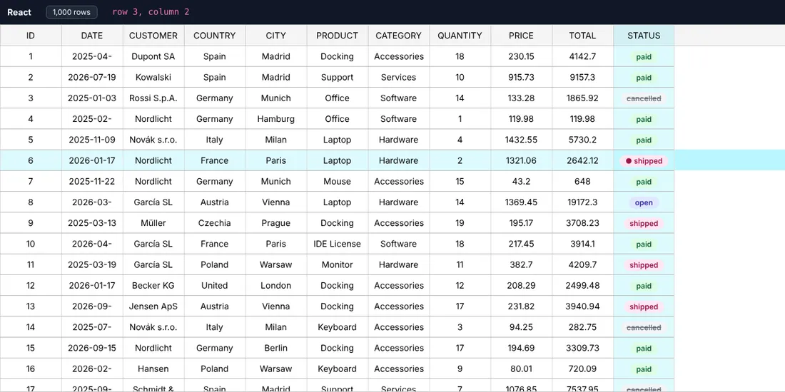
export function StatusChip({ cellValue, rowIndex }: CellProps) { const [hover, setHover] = useState(false); return ( <span className={`status-badge status-${cellValue}`} title={`row ${rowIndex + 1}`} onMouseEnter={() => setHover(true)} onMouseLeave={() => setHover(false)}> {hover ? "● " : ""}{cellValue} </span> );}// Episode 007 – the same orders model, rendered by the React wrapper.import { ComponentRendererWrapper, GuiexpertTable } from "@guiexpert/react-table";import { GeMouseEvent, TableApi, TableOptions } from "@guiexpert/table";import { useMemo, useState } from "react";import { createOrderTableModel } from "./model/order-table";import { StatusChip } from "./StatusChip";
export function App() { const [rows, setRows] = useState(100_000); const [info, setInfo] = useState("");
// a NEW model object rebuilds the table → keep model and options stable const model = useMemo(() => createOrderTableModel(rows, { status: new ComponentRendererWrapper(StatusChip) // episode 026: React component per cell }), [rows]); const options = useMemo(() => ({ ...new TableOptions() }), []);
const onReady = (api: TableApi) => setInfo(`${api.getBodyModel().getRowCount().toLocaleString("en")} orders`); const onClick = (evt: GeMouseEvent) => setInfo(`row ${evt.rowIndex}, column ${evt.columnIndex}`);
return ( <> <header className="app-header"> <b>React</b> <button onClick={() => setRows(rows === 100_000 ? 1_000 : 100_000)}> {rows === 100_000 ? "1,000 rows" : "100,000 rows"} </button> <span id="info">{info}</span> </header> <div className="table-div"> <GuiexpertTable tableModel={model} tableOptions={options} tableReady={onReady} mouseClicked={onClick} /> </div> </> );}The component gets cellValue, rowIndex, columnIndex, areaIdent and
areaModel as props. It is rendered as a real React element – hooks like useState work.
Angular
The component implements ComponentRendererIf – the table calls setData() instead of setting inputs:
// Episode 026 – an Angular component as cell renderer: implement ComponentRendererIf.setData().import { ChangeDetectionStrategy, Component, signal } from "@angular/core";import { ComponentRendererIf } from "@guiexpert/angular-table";import { AreaIdent, AreaModelIf, RendererCleanupFnType } from "@guiexpert/table";
@Component({  selector: "app-status-chip",  changeDetection: ChangeDetectionStrategy.OnPush,  template: `<span class="status-badge status-{{ status() }}" [title]="'row ' + row()">{{ status() }}</span>`})export class StatusChip implements ComponentRendererIf<StatusChip> {  readonly status = signal("");  readonly row = signal(0);
  setData(rowIndex: number, _columnIndex: number, _areaIdent: AreaIdent,          _areaModel: AreaModelIf, cellValue: any): RendererCleanupFnType | undefined {    this.status.set(cellValue);    this.row.set(rowIndex + 1);    return undefined;  }}
RenderWrapperFactory.create(Component, changeDetectorRef) builds the renderer once:
// Episode 009 – the same orders model, rendered by the Angular wrapper (Angular 14–22, here 22).import { ChangeDetectorRef, Component, computed, inject, signal } from "@angular/core";import { RenderWrapperFactory, TableComponent } from "@guiexpert/angular-table";import { GeMouseEvent, TableApi, TableOptions } from "@guiexpert/table";import { createOrderTableModel } from "./model/order-table";import { StatusChip } from "./status-chip";
@Component({  selector: "app-root",  imports: [TableComponent],  template: `    <header class="app-header">      <b>Angular 22</b>      <button (click)="toggle()">{{ rows() === 100000 ? "1,000 rows" : "100,000 rows" }}</button>      <span id="info">{{ info() }}</span>    </header>    <guiexpert-table class="table-div"      [tableModel]="model()" [tableOptions]="options"      (tableReady)="onReady($event)" (mouseClicked)="onClick($event)" />  `})export class App {  private readonly rwf = inject(RenderWrapperFactory);  private readonly cdr = inject(ChangeDetectorRef);  // episode 026: an Angular component per visible status cell  private readonly statusRenderer = this.rwf.create(StatusChip, this.cdr);
  readonly rows = signal(100_000);  // a new model object → the table is rebuilt  readonly model = computed(() => createOrderTableModel(this.rows(), { status: this.statusRenderer }));  readonly options = { ...new TableOptions() };  readonly info = signal("");
  toggle(): void {    this.rows.update(n => (n === 100_000 ? 1_000 : 100_000));  }  onReady(api: TableApi): void {    this.info.set(`${api.getBodyModel().getRowCount().toLocaleString("en")} orders`);  }  onClick(evt: GeMouseEvent): void {    this.info.set(`row ${evt.rowIndex}, column ${evt.columnIndex}`);  }}
Vue, Svelte, Solid, Preact
Their wrapper packages export a ComponentRendererWrapper as well – same idea, the component receives the cell
data as props.
Lifecycle
- Components are created only for visible cells and destroyed when the cell scrolls out of view – tested: after 20 scroll steps there are still 19 components in the DOM, not hundreds.
- That means: no long-lived state in the cell component. Keep state in your data (the row) or in a store.
- Components are heavier than plain renderers. For 10 columns × 30 visible rows that is no problem; for a heatmap with 400 cells per screen prefer classes and styles from the model.
Next
Colour from the value – chapter 27 (Heatmap).